Paid Memberships Pro Is GREAT @ Delivering Dripped Content

Paid Memberships Pro Is GREAT @ Delivering Dripped Content

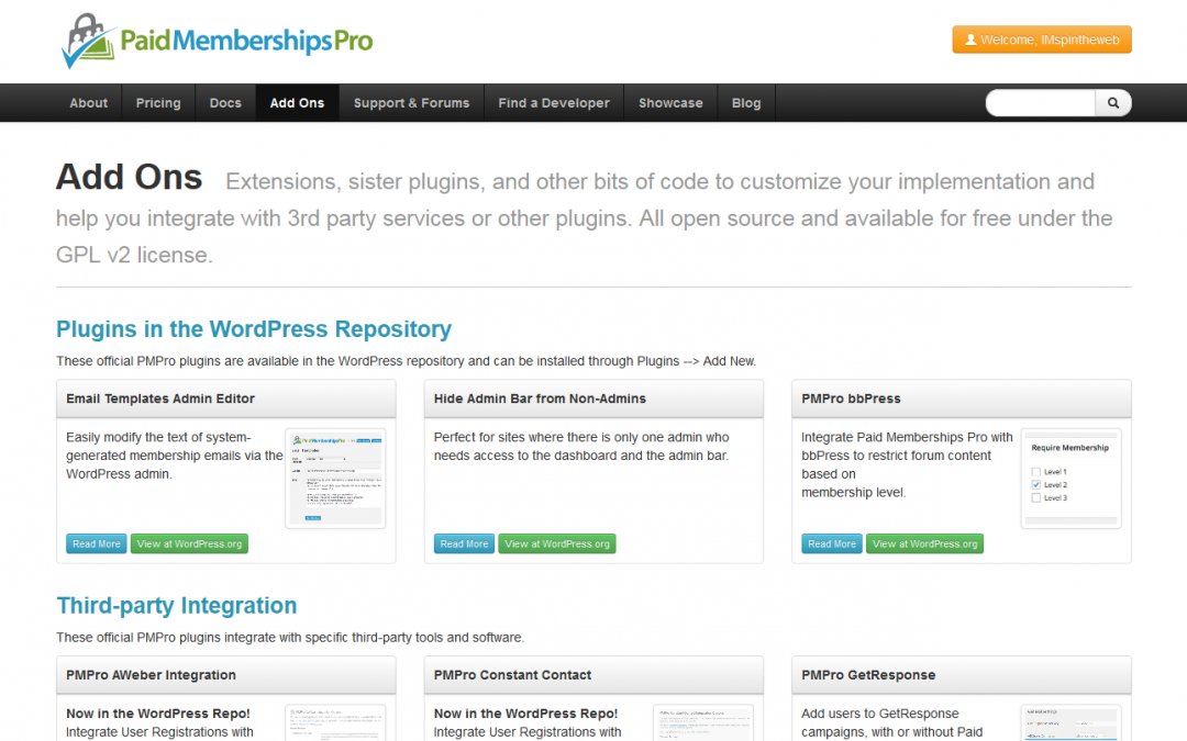
Paid Memberships Pro (PMP) is a membership plugin for WordPress that I came across a while ago when working on a Latin American Wellness GeoDirectory website.

At the time - the biggest requirement was gateway integration with a foreign bank, the backend had no current subscribers (though it turns out if you DO have current paying members - migrating them into PMP is not that time consuming at all, that recipe alone is worth the $100 to get into the paid member forum for a year)  - anyway, long story short is this - we set it up, got the billing and acl to work, added some membership level discounts and we were done with it. 

As it turns out - there’s quite a few FREE plugins available for it that really give this software an edge over the competitors.

Especially if you are interested in dripped content. It’s another tool to add to your web marketing arsenal that can add another dimension to your web presence and marketing with minimal effort.

PMP has a series plugin that is a breeze to setup, uses regular wordpress pages or posts as content AND it automagically emails your subscribers when the post becomes available.

That’s kinda cool!

The nice thing about dripped content is that if you set it up properly (as evergreen content, not dated or based on any particular time frame, like a product launch) then you can bring the prospect back to your website and use that page for engagement.

The right dripped content series can easily be just as, or maybe more effective than traditional emailed autoresponders simply because it’s more content based as opposed to informational.

Simply put - you can put more “stuff” on a web page than you can include in an email. That’s a pretty decent benefit and the value that “membership” can have on your website can be priceless!

Literally Priceless - the Paid Membership Pro plugin - and it’s counterparts - are 100% free to download and use!

How To Hide The Sidebar On The BuddyPress Registration Page

How To Hide The Sidebar On The BuddyPress Registration Page

Buddypress is the most popular social networking platform for WordPress and I use it on quite a few sites but there’s one site in particular that is running under Divi - which is not Buddypress compatible out of the box…

Anyway - long story short is Buddypress will use any template you want - but it adds the default sidebar and footer on most of it’s pages (if not all?) and under Divi the full sidebar shows up under the registration form and is kinda confusing to new users.

Registration, like a purchase should always be 1: EASY and 2: Have no distractions.

Instead of adding the files to a child theme and all that - just look at the body class of the Buddypress pages and use that to hide the stuff you don’t want to see!

The body class on the registration page is registration and the sidebar lives in a div with the id of sidebar - so the following css in Divi theme setting hides the sidebar on the Buddypress registration page:

.registration #sidebar  {display: none;}

If it doesn’t work (it will!) - try to add !important to the end of the definition above.

Hope that helps somebody!

Does Your Website Give You The Blues?

Does Your Website Give You The Blues?

With the vast amount of information available to you when you start looking into building your website - it’s easy to become overwhelmed by information overload!

For example - you have heard “the money is in the list” (IT IS!) and want to start building your contacts for marketing - but how do you do that?

Maybe you have a fantastic idea/product/service that you want to sell online.

You might just want a simple blog that is connected to the social web…

You start googling only to discover that there’s literally hundreds of ways to do EVERYTHING with a website and it’s all in a language you do not understand…

Now is your chance to Get CONNECTED!

What is the best way to build a website?

Short answer is “it depends on what you want to do…”

SpinTheWeb.com has been in business for 20 years. There’s nothing that hasn’t been done before and if there is - we have the experience to make your vision a reality!

Have your entire web presence professionally managed and get back to doing what you do best!

WordPress Audio Player Too Wide?

Is Your WordPress Audio Player Too Wide?

 this isn’t even really a post - just futzing around with the wordpress audio thingy…

It’s too wide…


Don’t always want the player to be full width?

Wrap it up in a div!


- embedded player code goes here -

And since it’s in a div - you can use typical css for whatever

 OR - and this is even better… add this css

audio {width: 50%; }

Optimizepress and Divi

Turns out this can be done! You just have to setup a multisite to run the “other” theme…

You should start with a new WordPress install so you can use sub directories unless you don’t mind using subdomains…

I have Divi on the “main” site and OP on a secondary site that will house sales pages and anything else I want to use OP for…

That’s pretty slick…

Keep In Touch!

Keep In Touch!

Join our mailing list to receive the latest news and updates!

GO CHECK YOUR EMAIL!

Pin It on Pinterest